By creating the environment i have done, i hoped to present and portray a mixture of feelings; from fear, trapped, and a feeling of being lost and alone in a world with monsters.
I decided to place the player in a broken down looking shed facing a dimly lit corner, and at first they would think they are alone, but as they focus on the multiple scary sounds playing in the back and the ability to look around at your surroundings the player realizes he is not alone and there are scary things outside and they have their eyes on him.
At first i created and edited the shack to fit the idea i had in my head with the help of multiple prefabs of lamps and dim light bulbs
Then i decorated my platform with multiple scattered zombies,
I then included a night sky box with a cloudy atmosphere
Reflection/Evaluation: I really enjoyed playing around with Unity and the freedom you have with creating almost anything. I feel like this project, although very simple is something that I am happy about, although I feel like I have yet so many ideas to add such as weather (rain, blizzard, fog) and maybe a winter themed terrain with a campfire.
1.Project Description: describe the space you created and the identity you used to guide the design.
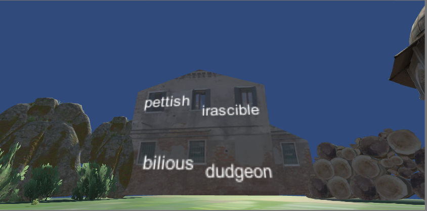
For my space that I created, I used several different external assets and Kaplan’s GRE words. I am interested in how VR can be utilized in improving educational learning, and thus I decided to play around with the space that I made in order to create a small prototype of how learning vocabulary can be made easier by placing various GRE words around the space, in accordance to their word groups.
For my space that I created, I used several different external assets and Kaplan’s GRE words. I am interested in how VR can be utilized in improving educational learning, and thus I decided to play around with the space that I made in order to create a small prototype of how learning vocabulary can be made easier by placing various GRE words around the space, in accordance to their word groups.
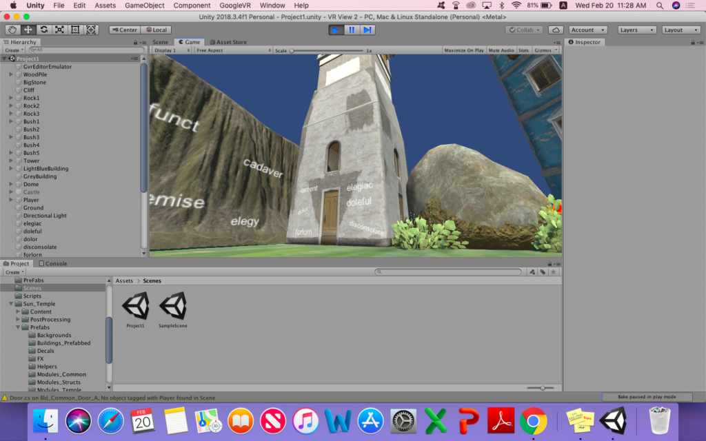
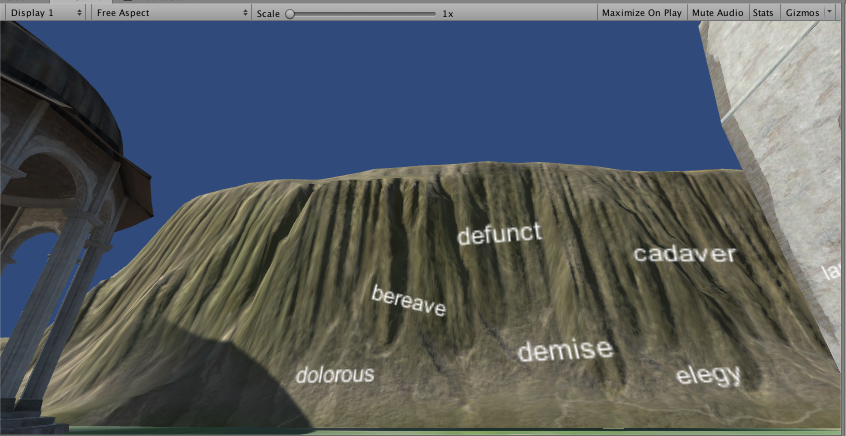
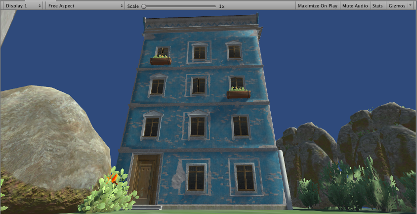
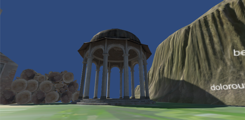
I decided to use the identity of “abandoned” in order to guide the design. I choose the colors, assets, and texture so that they match the “abandoned” identity. I chose buildings that had somewhat a mysterious feel, rather than any building with a majestic, luxurious-looking façade. In order to create the “abandoned” identity, I wanted to mix nature and human-built objects, and thus, I have placed various rocks and cliffs between the tower and the dome. This is because my image of “abandoned” is usually at the middle ground of nature and man-made, or perhaps, nature is gradually taking over the man-made objects because the objects have been left abandoned for a long period of time.
However, the sense of “abandoned” does not necessary mean that the place is completely dead. Therefore, I placed bushes that are being blown by the wind, and I made the sky color the typical sky color – nothing dark or grey.
2. Process and Implementation: discuss how you built the scene within the development environment and choices you made to stage the space for this particular mode of viewing.
What design decisions did you make to represent the identity (emotion, feeling, mood) and to aim toward the desired effect of it being an alternate world? What guided your composition of the areas in view and what effect were you hoping it might have on the viewer? Feel free to share images or sketches of visual inspiration or reference if you used them.
In order to express the identity of “abandoned” in my design, I decided to unify my scene with dark, gloomy colors for the man-made objects, such as the buildings, tower, and the dome. I accumulated textures that had mostly black, grey, and dark colors so in order to create a mysterious and lonely mood. Even for one building which has a light blue color, there is something about the ratchet texture that makes even the light blue color show its dark side.
I used the below images when brainstorming my idea.
Abandoned Image 1
Abandoned Image 2
I also chose GRE words which have negative connotations in order to match the identity and the mood of the alternative space that I created.
The following are the word groups that I chose to place in the space:
As much I want the user to understand and visually memorize the GRE words, I want the user to feel like they are in an abandoned town that is separated from the rest of the world. However, I did not want the user to feel as if they are in a fictional world, and thus I placed objects that are familiar in real life, yet with a feeling of far and distant.
3. Reflection/Evaluation: This should discuss your expectations and goals in the context of the what you felt was achieved with the finished piece.
In the beginning, I was going to compress different scenes with different moods which matched accordingly to the GRE word group. For example, for the GRE word group which roughly all meant “delighted,” I was going to create part of the scene which showed that mood. However, I realized that creating multiple scenes each with different moods was too complicated. Not only that, mixing moods in one space was not a good idea as it would confuse the user. Therefore, I decided to choose to the “abandoned” identity, and bring in various GRE words that had had negative and pessimistic connotations.
If I look at the scene that I have created from the scene view, it seems as if the space is small and enclosed. However, when looking from the actual game view, the scene seems as if it has so much to it. Therefore, I am quite satisfied with the scene that I have created because it fulfills the purpose of trying to help the user visually memorize the GRE words using location sensing.
I would say that one of the challenges I faced in this project was placing the GRE words in the optimal location. Because the GRE words are 2D, whereas everything else is 3D, I had to maneuver the GRE words in a way that they seem as if they are stuck to the building or the rock. It took a quite a bit of time to adjust each and every word because I was trying to place a 2D object with the 3D objects.
Welcome to Nerudia, a mystical land of trees, mountains, and all things mother nature!
demo videoNerudia at a glance
Projection Description:
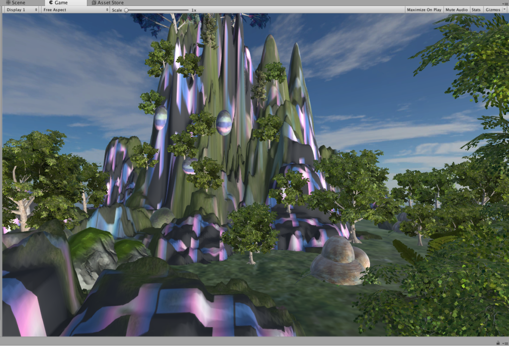
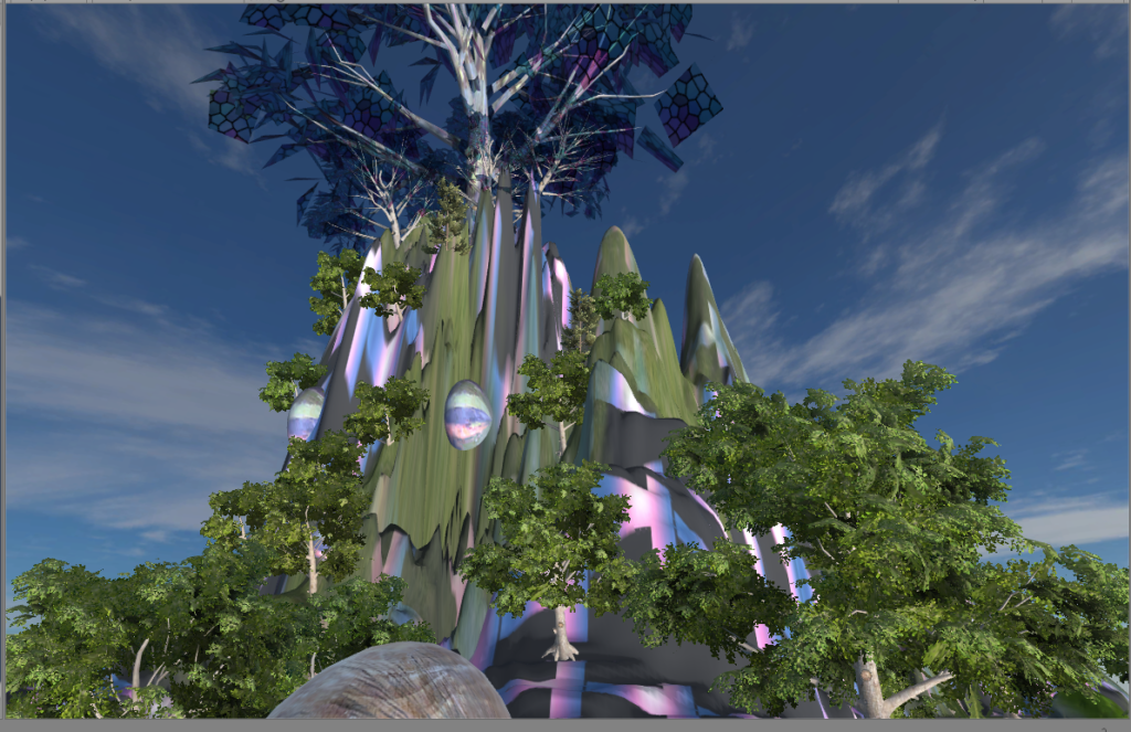
Nerudia is a nature-filled land characterised by its tall hills, bountiful trees, plants and rocks. I’ve chosen “mystical” and “grandiose” as my main direction for the identity of Nerudia.
Process and Implementation:
Knowing that I wanted to create a grandiose effect with tall mountains and hills, I started playing with the terrain feature to experiment with different heights for the ground. I initially built mountains and trees all around but after quickly realizing not all this will be visible from a single point where I put the player, I redesigned it so that the tall hills are on one side. I ensured the other side is more sparsely packed with trees and with shorter ones as well, so as to emphasize the tall hills more and create a contrast between the two. Building contrasting materials is a design strategy that I’ve repeatedly used for this project – emphasizing something and making it pop out more by creating others that are unlike it.
To add to the grandiose component, I decided to add a Mother Tree for Nerudia – an evident landmark that is symbolic of the place. So I placed a giant tree on top of the mountain, so the player can look up from the ground and really feel the power of its size and elevation. Again to make the Mother Tree stand out more, I made sure all the other plants and trees were properly colored green. I also added a Directional Light that lights the hills up from the bottom to brighten up the hills and Mother Tree more.
view of Mother Tree from below
I also experimented with the color and texture of the mother tree leaves, and eventually went with a glass reflective material I found in the Asset Store. I also decided that color was key to tackling the “mystic” identity. To do this, I looked for various different textures that I could apply to the hills and mountains. I discovered a purple-blue-neon-colored stripes that added lava-like effect to the hills. I was careful not to overuse it and applied it only here and there to build up to the hills and the Mother Tree.
On the other side of the hills, I left the space less dense and only populated it with small plants so the player is not overwhelmed with too many materials around him/her. This relatively empty space was to create some breathing space for the land and the player. I also designed and made some stone-like structures to place around the ground. I also designed and made some stone-like structures to place around the ground.
Reflection/Evaluation:
I think Nerudia turned out quite well and I’m happy with its overall design and aesthetics. I’ve asked for feedback from my friends and they agreed that they felt the “grandiose and mystic” vibes from Nerudia. One friend even commented that she felt like “going on an adventure up the hills.” Designing a concept that suited the identity was central to my goals for this project so I was happy to hear that my friends agreed.
In the beginning, I was struggling with how to convey the “mystical” element because before adding the neon texture, it looked like a normal forest to me. Searching for an interesting texture really helped my concept and I think it played a big role in shaping the identity of Nerudia. Both the color scheme and the use of glass reflective material for the Mother Tree really defined the “alternative world” for me – something that we can identify as making sense but is different from the norm and what we expected. In other words, we would expect to see leaves on trees, but might not anticipate them being made of glass materials. Similiarly, we would expect to see mountains to be green in most cases, not some neon-colored stripes running down the hills.
I created an upside-down living room, in which the effect of gravity still works and can be seen. The aspect of reality that I would like to address is that the gravity and orderliness in the real world have been taken for granted by us and viewing the exact same thing from two opposite perspectives can give audience a total different experience and knowledge of what’s existing around us. It’s also supposed to emphasis the sense of space and gravity – how does the world looks like with gravity when everything is upside-down?
The identity in the alternate reality: gravity, disorder, upside down, broken
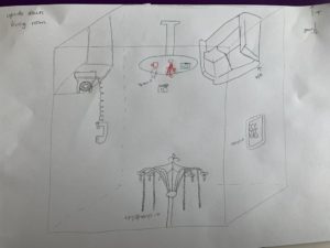
Sketch
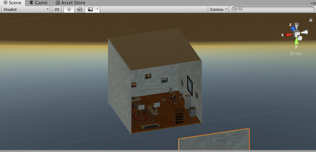
Final look
2. Process and Implementation:
During the project developing process I encountered some difficulties in terms of technical issues, how to achieve the gravity effect I want, and how to decide the best place to put the camera so the viewer will get the most out of my project etc. In the following I’ll highlight what made me choose the objects to represent my chosen identity, the reason behind my camera positioning and some processes of how I solved some problems.
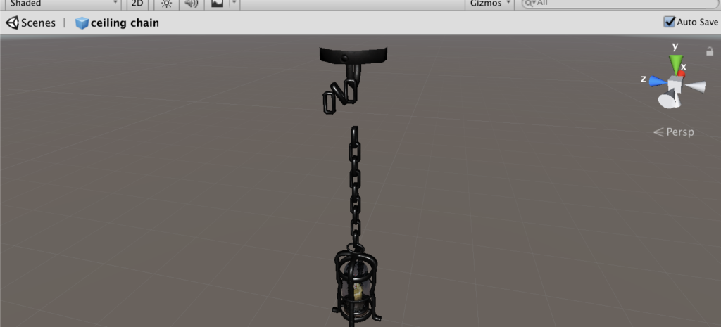
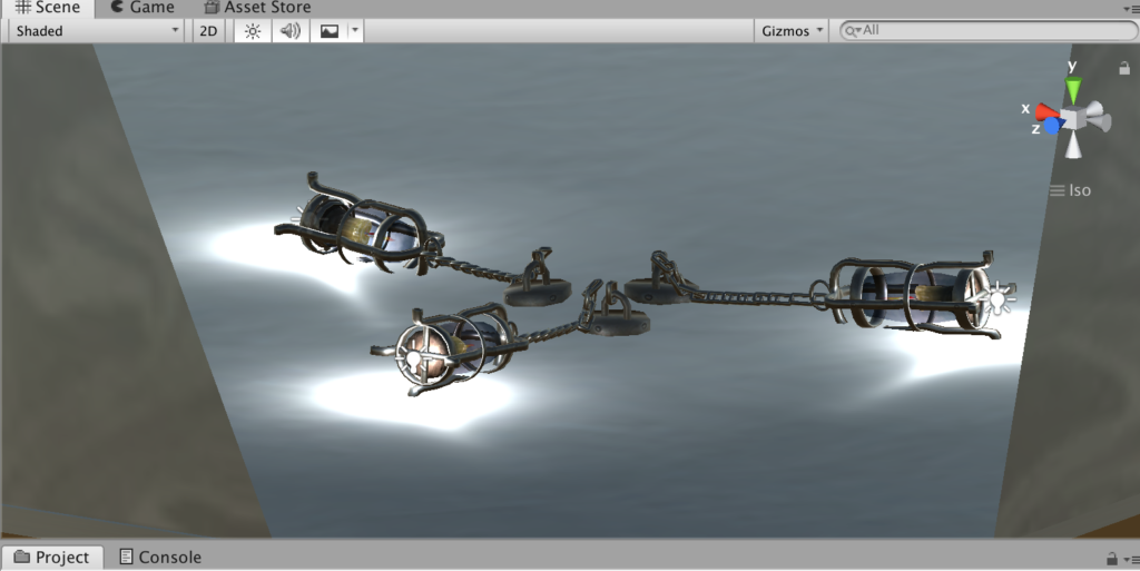
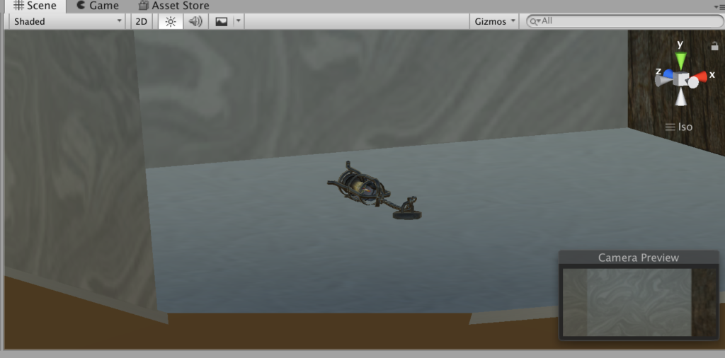
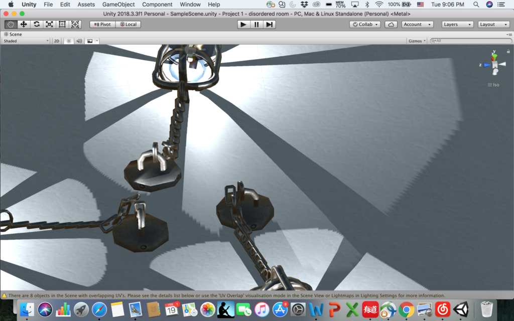
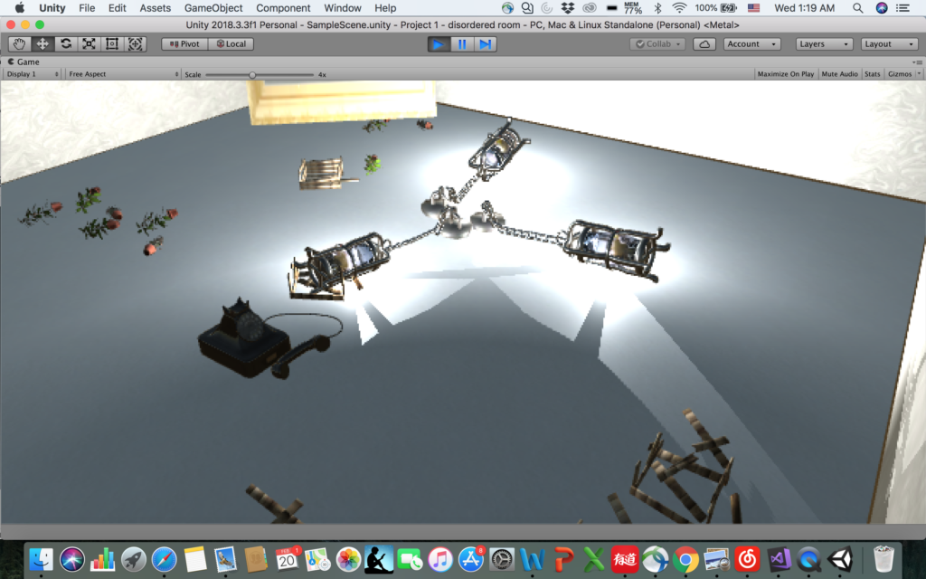
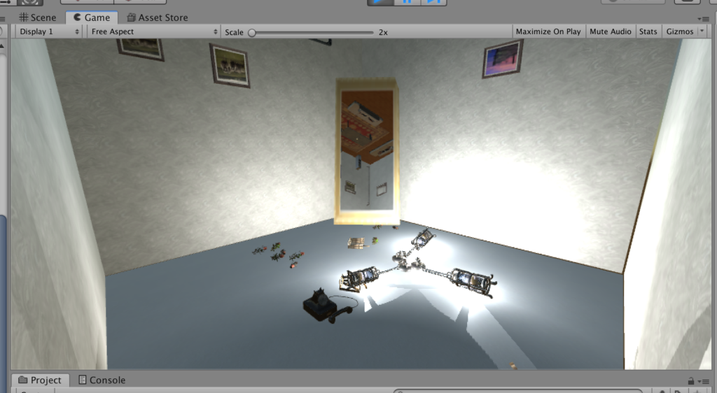
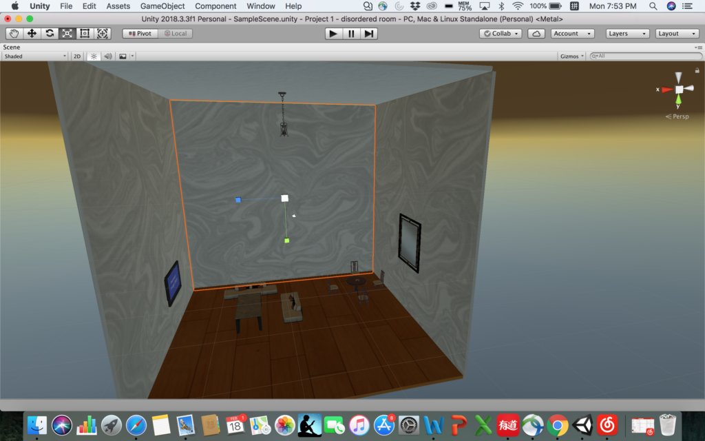
The chandelier with chains falling on the ground
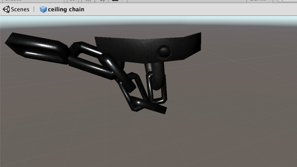
In order to embody the effect of gravity in this upside-down world, where the “ceiling” becomes the “floor” in this case, I played around with the chandelier with chains – in the normal discipline when it’s hanging the chain will be straight, but in this case it should be on the ground, which is obvious enough to show the viewer that the gravity does exist in this environment. In order to do that, I downloaded a chandelier prefab and break down the iron hoop on the chain one by one and reorganized them to make it looks like “staying on the ground”, as shown below:
Break down the iron hoop and reorganize it
Final look of chandelier on the ground
Break down the iron hoop and reorganize it
Finished single model
Final look of chandelier on the ground
The water pumping out of pipes – partical effect
The initial idea was to add the upside-down mug and the water drop coming out of the cup, but taking into consideration of the realness and the time for animation partical, it seems not realistic if there is water endlessly keep falling out of a mug, but the water falling is another obvious way to indicate gravity, so I changed it into water pumping out of the old broken pipes, which also cater the “broken” theme.
water pumping out of pipe – view from cameraPartical effect
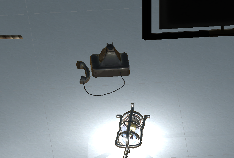
The telephone with microphone falling on the ground
This came from my initial daft, because the microphone on the ground indicated it fells down from somewhere, and it leaves imagination for viewers to think what happened before in this room.
Messy floor resulted from things falling down: plants, broken wooden boxes, telephone
The design of this scene indicates the things falling down because of the gravity, it caters the broken and messy nature of chaotic upside-down, also leaves space for viewers to image what happened before here.
Camera positioning and the mirror
It took me a lot of time to decide where to put the camera so the viewer will see most of my design of the room while feel comfortable viewing around. I tried to put it in the middle of the room first, but it takes effort to have a clear view of what is right below or above you. Then I figured the best way to have a comprehensive view of a room is to view the room from a side perspective instead of being in the middle of it. So I moved the camera to a corner of the wall. Surprisingly I happen to placed it under the water falling effect, so when I looked up I feel the water is about to falling on my face! That was such a real experience, so I decided to keep the camera that way so when the viewer look up there will be this kind of “immersive” feeling. However, doing this means I give up the sight to the the pipe, because the viewer is right under it. Then I added a mirror which can actually reflect, I put the mirror across to where the camera is, so the viewer can just look ahead into the mirror and she/he will know what’s going on above him/her and why there’s water falling down. The mirror helped me solve the problem of lack of sight so I decide to just keep the camera in the corner.
Mirror reflecting the view above the viewer
Adjust the scale of texture
This is a difficulty I overcame with the help of Sarah. When I was doing the design of the overall layout of the room, I put wall paper and wooden floor to make it look more like a living room, however, when I applied those textures to the materials, it’s been stretched so much that it didn’t look real at all (shown as below). But later I solved it by changing the tiling parameters.
stretched texture
3. Reflection/Evaluation:
This project pretty much satisfied all the expectations I had before I started: in order to show the gravity effect and the sense of being upside-down, I made the partical water falling effect, I designed the chandelier with the chains falling on the ground, the upside-down photos on the wall etc. And during the process I added the mirror with actual reflection to tell the viewer what’s happening above you, since I placed the camera in a lower corner of a wall to make up the lack of light since it’s in a corner and achieve a better effect of immersion (viewer standing under the water fall and can see it falling down on you).
However the things I will consider to improve the project includes adding sounds effect, like the steel lander cover of the chandelier rolling on the ground, the sound of water pumping out of the pipe, and something hanging in the middle of the room and swing around to show the gravity etc. Overall I think I’m satisfied with this project and it achieved what I expected.
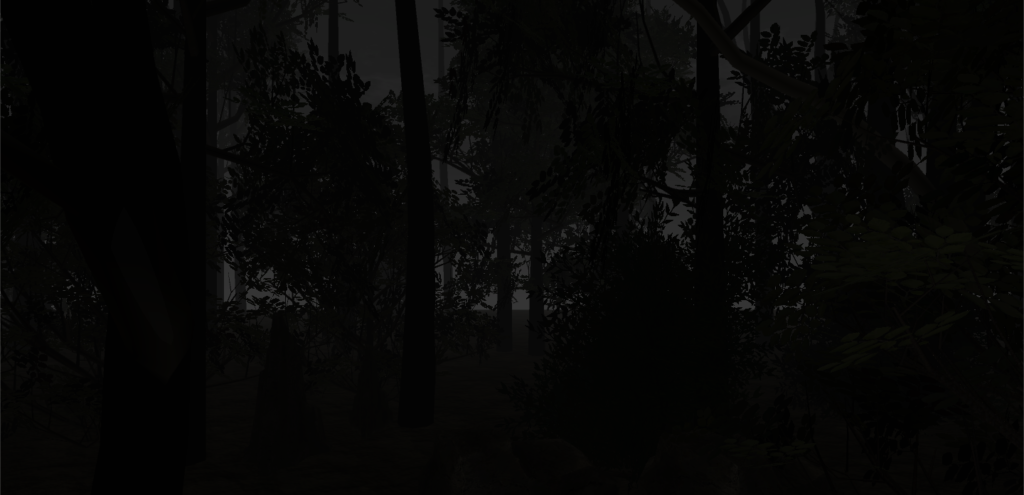
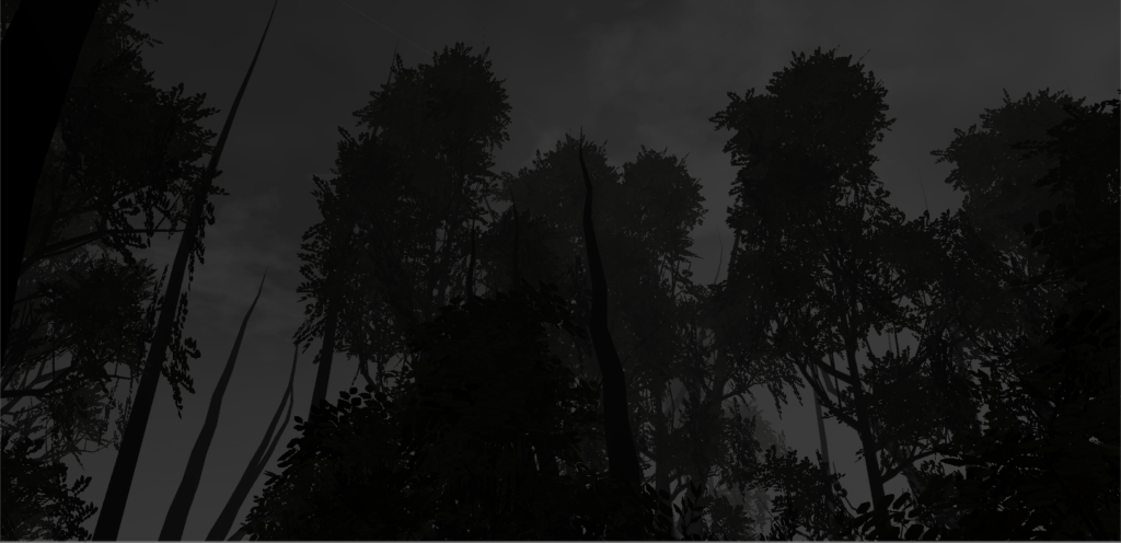
Color is an inherent part of some of our daily lives. It can add vibrance or even different moods – a bright yellow can inspire happiness whereas a dark blue can inspire sadness. With this environment, I wanted to explore how the absence of color could affect a mood. I created a forest with a completely desaturated sky and ground, making its identity one that is eerie and spooky.
Process and Implementation
I was initially inspired by the idea of a spooky forest when playing around with the tree building function of Nature Starter Kit 2 since the branches of the trees could be warped in a way that were windy and pointy.
When browsing pictures of spooky forest images, I noticed that a lot of these images were in black and white as if to enhance the creepy effect, hence inspiring me to create a black and white forest to add on to the eerie effect.
In terms of what to put into the actual environment, a lot of my implementation had to do with what I came across in the assets store. I wanted my environment to look a little more realistic, so I kept this in mind when browsing various packages.
The trickiest part was definitely getting the lighting right. I removed the directional light and added fog in order to give the illusion of nighttime, choosing a night setting because night is inherently more spooky than day. However, my biggest struggle was with the skybox. I would try out different materials with different combinations of tint and exposure in order to try and remove the color, however there always seemed to be a slight tinge of color. I eventually realized that I could just edit the saturation out of png images of the panels using a simple photo-editing website (Pixlr), and then place these edited panels into a new skybox material. This finally completely desaturated the sky and gave the effect I was going for.
Reflection/Evaluation
Overall, I think the eerie effect was accomplished because of the absence of most color and the choice to make it nighttime. However, I do think it’s possible that someone could be in this world and feel at peace rather than spooked out, depending on what their feelings towards nighttime forests are. If I were to build upon this, I think I would try and add some animations or sounds in order to enhance the spooky effect. For example, it would be cool to have wind whistling so that the user could perhaps feel “chilled,” and have some leaves rustle in the wind.
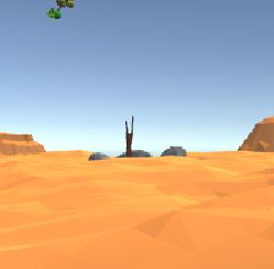
The location that I place the user in is a desert surrounded
horizontally with objects representing a dry world but juxtaposed with objects,
found in the sky, that complement the dehydrated environment. The identity used
as a basis for the project was complementary,
an adjective that explains how two parts can come together to “mutually supply
each other’s lack.” The desert is composed of dunes, mountains, rocks, and
logs, all familiar objects that one would expect to find in a desert. The sky
on the other hand, is filled with floating spheres covered with vegetation and
trees as well as floating blue cubes, representing the water that is supporting
the mixed environment. Not only do the orange-red colors of the desert
complement well with the blue-green colors in the sky, but the dehydrated world
also complements with the hydrated world. The four core elements are all well
presented as well. The earth and fire in the desert and the wind and water in
the sky. In our reality, there is some impossibility in having organic spheres
and cubes floating above a lifeless environment. This alternate reality on the
other hand, has other laws governing physics; this permits a natural yin yang of
elements to form.
Most of the prefabs I found were originally from a free
asset pack. The terrain was skillfully pieced together with scaled desert tiles
in order to give the user a perceived view of infinite dunes. Making sure that
the user couldn’t see the edge of the tiles gave a more realistic feeling since
deserts usually are quite large. In one corner a mountain range was set up with
differently scaled mountains to give the perception of depth. Other rock
monuments were also placed around the user to further reinforce the feeling of
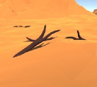
depth in a large desert. Finally, a collection of stones and logs were placed
all around in different formats to gives the environment a bit more meaning.
Before adding in the complementary objects in the sky, the desert looked
essentially like one humans would be used to.
The feeling of being in an alternative world really started
with the placement of floating objects. Everything originally looked “normal”
but once the user started looking around and seeing things in the sky that were
not the sun, then their perception changed. The objects in the sky were also
populated by prefabs that were specifically rotated and scaled in such a way to
give the user a new experience. Some of the floating spheres and cubes were
placed far away and others nearby, once again to promote depth, but they were
also designed to all be unique in order avoid pattern recognition. A few were
also designed to have huge trees on small spheres in order to further inhibit
the user’s original basis of logic. By altering the user’s perception of
physics, this world that combined four elements in a harmonizing manner could
come to exist. This coordination would not normally be found in our reality so
it was necessary to convince the user that they were in a different reality.
In order to force the user to think a bit more, since that
usually helps a player connect better with a new world, some small details were
hidden in the environment. Some of the collection of logs and stones were
gathered in a formation that promoted purpose, perhaps urging the user to
develop a story. This is evident in the stones encircling a log, maybe
supporting the hypothesis that some creatures lived here and camped, or a group
of dead logs packed together next to a shadow, as if they fell from somewhere. These
details asked the user to perhaps look into the sky and seek out the source of
the logs or seek out the unknown creatures. After looking into the sky, maybe
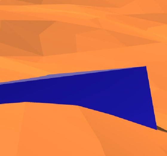
the user would even discover that there were only 5 water cubes in the sky but
6 floating spheres. The last cube was at the foot of the user, buried in the
sand, perhaps for some unknown reason. My final goal was for the colors and
objects on the ground and in the sky to complement each other in such a way
that was usually impossible in our reality, all the while also giving the user
a story to explore and formulate hypotheses about.
I believe I did develop a story and an environment that came
together smoothly. Using prefabs from an asset package naturally limited my
possibilities but I feel that I achieved with what tools I had. Naturally,
there is always room for improvement, especially in a 3D world. Using low-poly
objects made it easy to pay less attention to details. Ideally the objects used
would have been a bit more realistic. This would have been more effective
because there would have been more room for storytelling and connecting with
the user’s experience. This would have required a much greater time commitment
which was not available for this project. This would have been time consuming
because the spheres would have to be carefully populated with even more well
picked vegetation and the entire desert environment would have to be designed
to better give the sense of sand and depth. Better representation of fire and
wind would also be done by implementing wind drafts and scorch marks in the
sand. I expected there to be more presence in this world but after designing it
I understand where the fault is. There is no movement in the environment,
giving the user the feeling that they are stuck in place. This could have
possibly been achieved by rotating the sphere and cubes and implementing some
sort of sandstorm. In general, the desired effect of this world on the user was
achieved but not nearly to the extent that was originally anticipated.
Blog about a particular environment that you like and why (from physical world, from a movie, a theater set, in a book, in a game…). Think about what makes it a place – something more than a space.
My favorite environment is the Escape Room I went with my friend two months ago. It was designed based on a story of an abandoned baby who grew up at a circus and became the clown. Our goal was to discover the life story of the clown and to release his soul from the ruins of the circus. The whole room consisted of four individual spaces, and there are several puzzles we had to solve in order to get into the next room. In the first room, we had to figure out the relationship between the ‘clock’ and how we hit the ball, and to press the correct pictures on the wall in order to start the whole game. After we entered the second room, the clown played us the song he always listened to during childhood and we had to sort out five clips of the song. Also, we needed to figure out how to adjust the lighting of the room based on the most happiest nights the clown could recall. Then I entered a wardrobe while my friend entered the third room. I had to solve the puzzles alone and pass the clues to my friend so that she could stop the ceiling from falling. I was locked inside the wardrobe for the whole time until my friend solved the puzzle in the last room with my help, and we finally escaped.
The reason why I liked the Escape Room was that it provided such an immersive experience, where we learnt about a well-organized story (although it was completely fictional). Unlike all the other games I played before, it combined physical interactions with the facility and mental exercise together, and required more than simply pressing the buttons. We were truly involved in the game and became part of the space, which was explorable.
One of my favourite places that I am comfortable in is a gaming room on campus (won’t specify where it is). I love gaming because it makes me not think about my surroundings and dive into another reality. One of my favourite games is Battlerite. It is a free to play game available on steam. “Battlerite is an action-packed Team Arena Brawler focused on competitive PvP combat. Fight side by side with teammates to the sound of the roaring crowd in vibrant, colosseum-style surroundings. The arena awaits!” (www.battlerite.com). It is a wonderful game, which makes me an arena gladiator where you don’t have to scale your character. Just pick one and off for battle!
My favorite environment is the town in Animal Crossing. Animal Crossing is a game where you start a town and become a mayor of the town. The player is supposed to farm, pick apples, fish, talk to towns people in order to run the town. Every time I feel stressed out I feel the urge to play this game. It almost has a soothing value to it because of the music, lifestyle, and the characters.
As soon as you start the game, I can notice that the game has started due to the song. Animal Crossing has a very distinct music that plays as the player interacts with the game. Player can even make their own songs. Whatever, soothes the person can be played throughout the game.
It is also the lifestyle the game has. The objective of the game is not fighting against evil monsters nor becoming a hero. However, the game focuses on what a person would do on a daily basis if they lived outside the city.
The main reason why this game is my favorite environment is because it portrays the ideal lifestyle that I would like to live. The reason why this game is so popular, I believe, is that it lets people run away from the busy reality and lets them explore what its to like to live a simple life.
This game also reminds me of a transcendentalist Henry David Thoreau’s book Walden. The book is about the author living independently nowadays considered a ‘a manual for self-reliance’. Although it is seems almost impossible for me to actually life a self-reliant life, it seems possible through playing Animal Crossing.
After spending countless hours playing the game as a child, I became enthralled with the idea of living in the Clash of Clans world. Clash of Clans is a medieval online strategy game where players need to create, design and protect their home base location. Barbarians are the staple warriors in this world, and they are hailed by everyone because of their scary, fear-provoking countenance. However, there are a vast plethora of warrior types and they are all willing to die in battle in order to either protect their base location or contribute to the war efforts of expansion. As the owner of your base, you have the liberty of designing a layout that is capable of withstanding attacks from other clans with minimal damage caused. Most importantly, you must protect your clan castle as it is the symbolic statute that symbolizes your union to a wider community: your clan. The protection of your clan castle and anything that demonstrates your allegiance to your clan is valued so much that even the King and the Queen of your base become the most powerful warriors if need be, willing to defend the clan castle at all costs. This culture of brotherhood and belonging is what makes me desire to live in this alternate reality as these values are relatable to me regardless of the otherworldliness of the Clash of clan’s world. As someone who comes from a small, tight-knit family, I want to live in a place where I know that my peers and the rest of my community members have my back and vice-versa. In addition, I consider myself a really ambitious person and the idea of owning my own base and make it the best one around through my own efforts and ideas is definitely captivating.